How we standardized Gap Inc.'s platform without flattening its brands
Role: Lead Product Designer
Duration: ~1 year
Partners: UXD, PM, Eng, A11y, Copy, UXR, Data Analytics, Design Systems, Brand
Gap Inc. runs four brands – Gap, Old Navy, Banana Republic, and Athleta. For years each one ran on its own separate frontend, built and shipped independently. That meant every brand had its own version of the same components. Nothing was shared by design, so even a simple update could take months to ship.
I led design on a significant portion of the migration to a new, unified component system, primarily across Browse, spanning both web and native app. About 35 foundational components, built once and reused across all four brands instead of maintained separately by each.
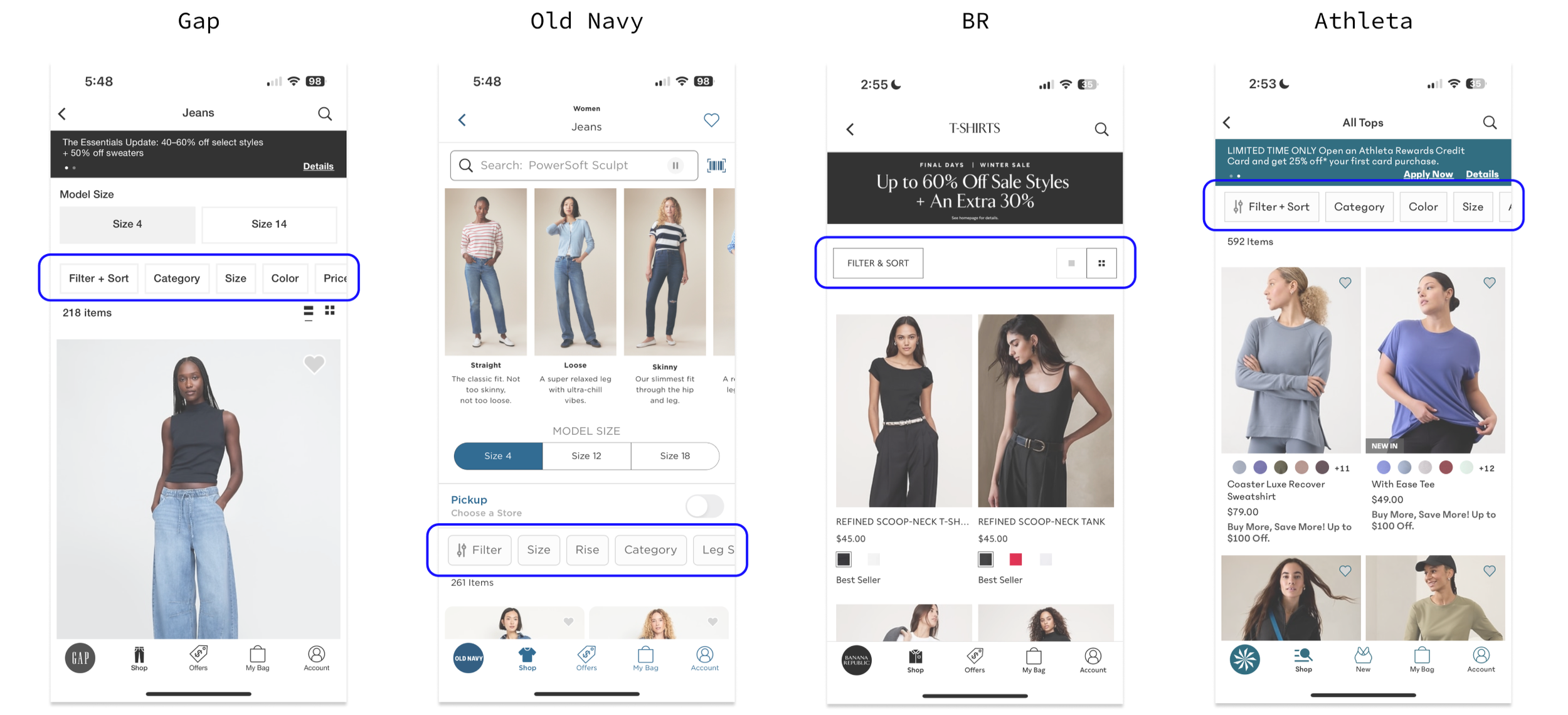
Before: Same page/feature. Four uniquely different builds.
Four brands, one system
Unifying everything sounds simple until you remember each brand has its own point of view and its own customers with different needs. It started below the components themselves, at the token level. Color, spacing, type, corner radius, dozens of small decisions that all had to align before anything else could get built. From there, every component was its own negotiation, grounded in the data we had.
Product card, up close
This tension showed up clearly in the product card, the single most repeated component on the whole platform. Every brand needed the same basic pieces: image, swatches, name, price, reviews. But how much to show, and how to display it, was a real fight.
The clearest example was pricing. Old Navy wanted the discount percentage shown right next to the price, their customers are deal-driven, and hiding it would have hurt conversion. Banana Republic wanted it hidden entirely, showing a percentage off felt cheap against their premium positioning. Rather than building two different cards, or forcing one brand to compromise, we added the discount display as a built-in option inside the one shared component. Every brand got access to the same functionality. Whether to turn it on was up to them.
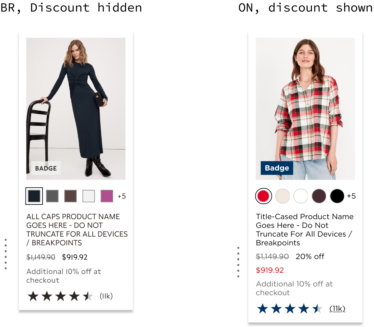
Where it landed
With the new system in place, redesign timelines that used to take about three months shortened to about two weeks. Business metrics held flat-to-positive the whole way through, and nobody, design or engineering, had to build the same component four times, ever again
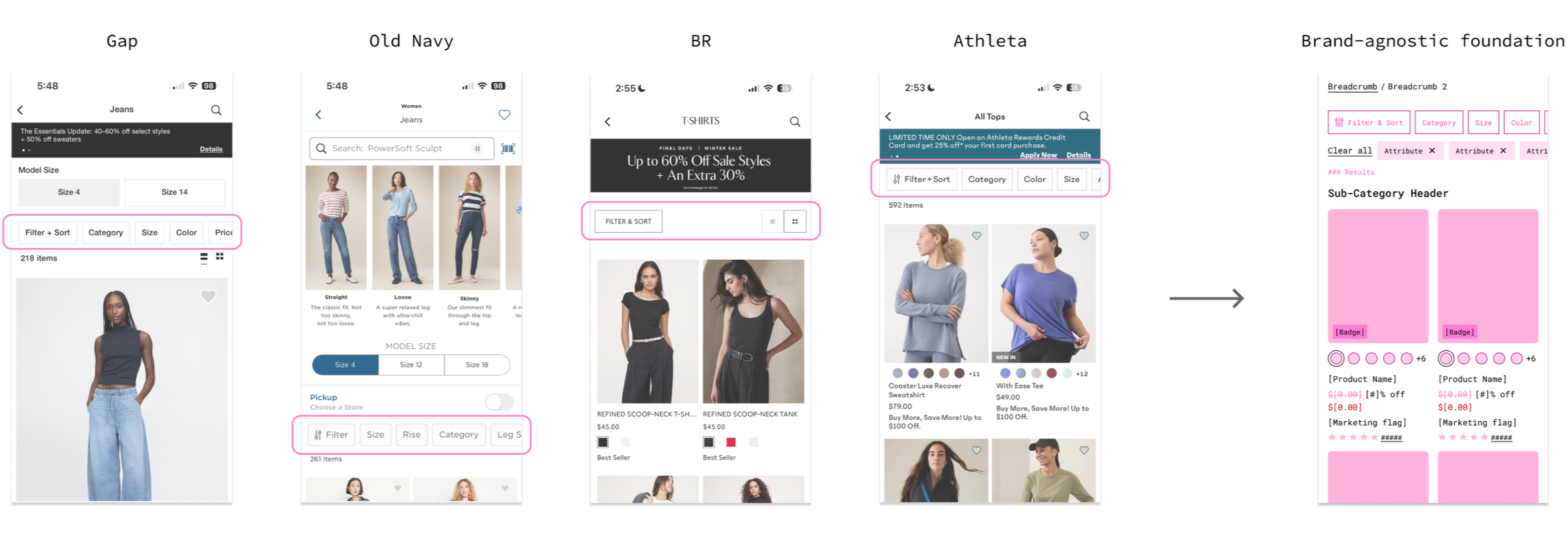
After: Four brands, one unified system
What I learned
Measuring impact is difficult when you're changing more than one thing at a time. It was hard to say "this exact thing worked" when ten things moved together. Four brands also meant four different working styles, so alignment was a huge part of the process.