How we found real value in Google Play's post-install page
Role: UX Research, Design support
Duration: Multi-month
Partners: UXD, Eng, PM, TPM
Right after someone installs an app, while they're waiting for it to download, they land on a page of recommended apps. Before this research, that moment was largely unexplored. What do customers actually want to see here, if anything? What headspace are they in?
At the time, the only ad format there was a plain icon cluster, and it ranked dead last among install surfaces. I led the research on what should actually go there instead, from consumer research through live RITE testing.
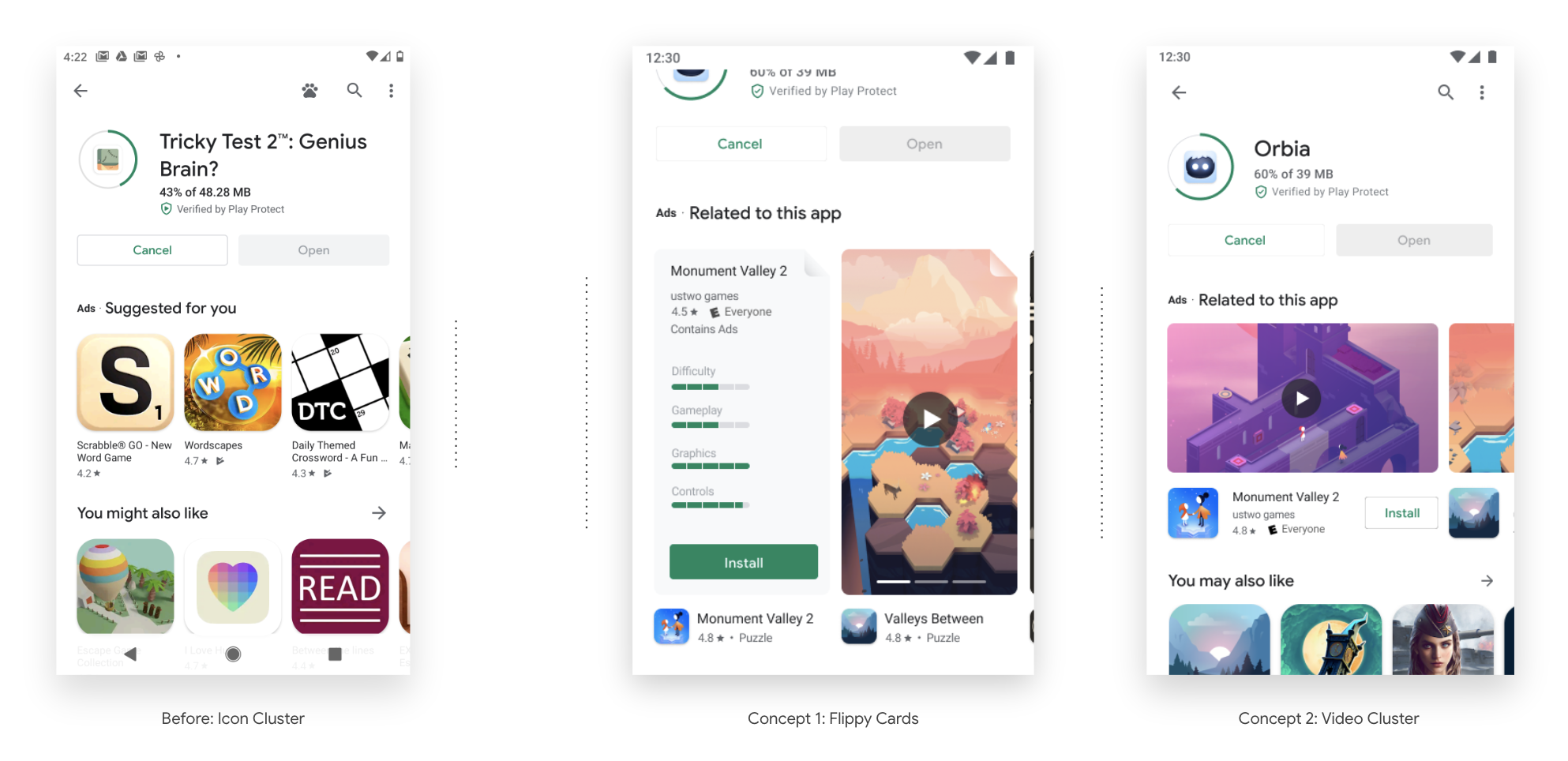
Comparison is key, but only for some
Existing research on consumer behavior suggested people are more likely to act on low-risk decisions (like installing an app) when comparison takes little effort and feels enjoyable, the same instinct as grabbing candy at the last minute at a grocery store checkout. We used that as our guiding principle going in.
But comparison only helps the right customer. Some people are still browsing, open to comparing options. Others already know exactly what they want and are just waiting for it to finish installing, and for them, more apps to compare is just noise.
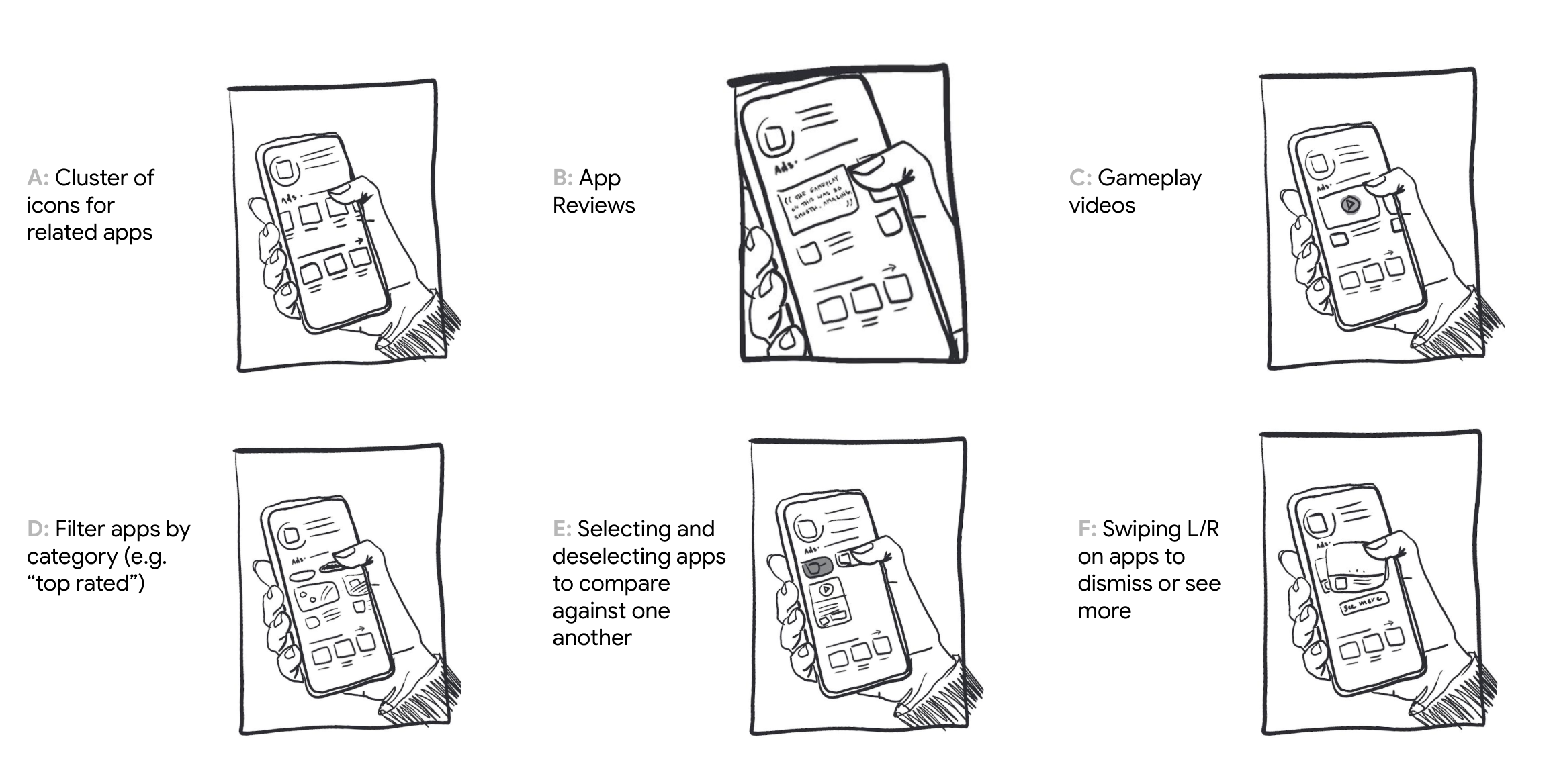
To test this, I storyboarded six directions and ran them through low-fidelity concept testing.
It depends what kind of app we’re talking about
The signal was clear. People wanted a real way to compare, not just more icons to click through. This confirmed the mindset split we'd suspected, and it surfaced something new too. What people wanted to see depended on the type of app. A utility app vs a “fun” app, for example, called for entirely different formats.
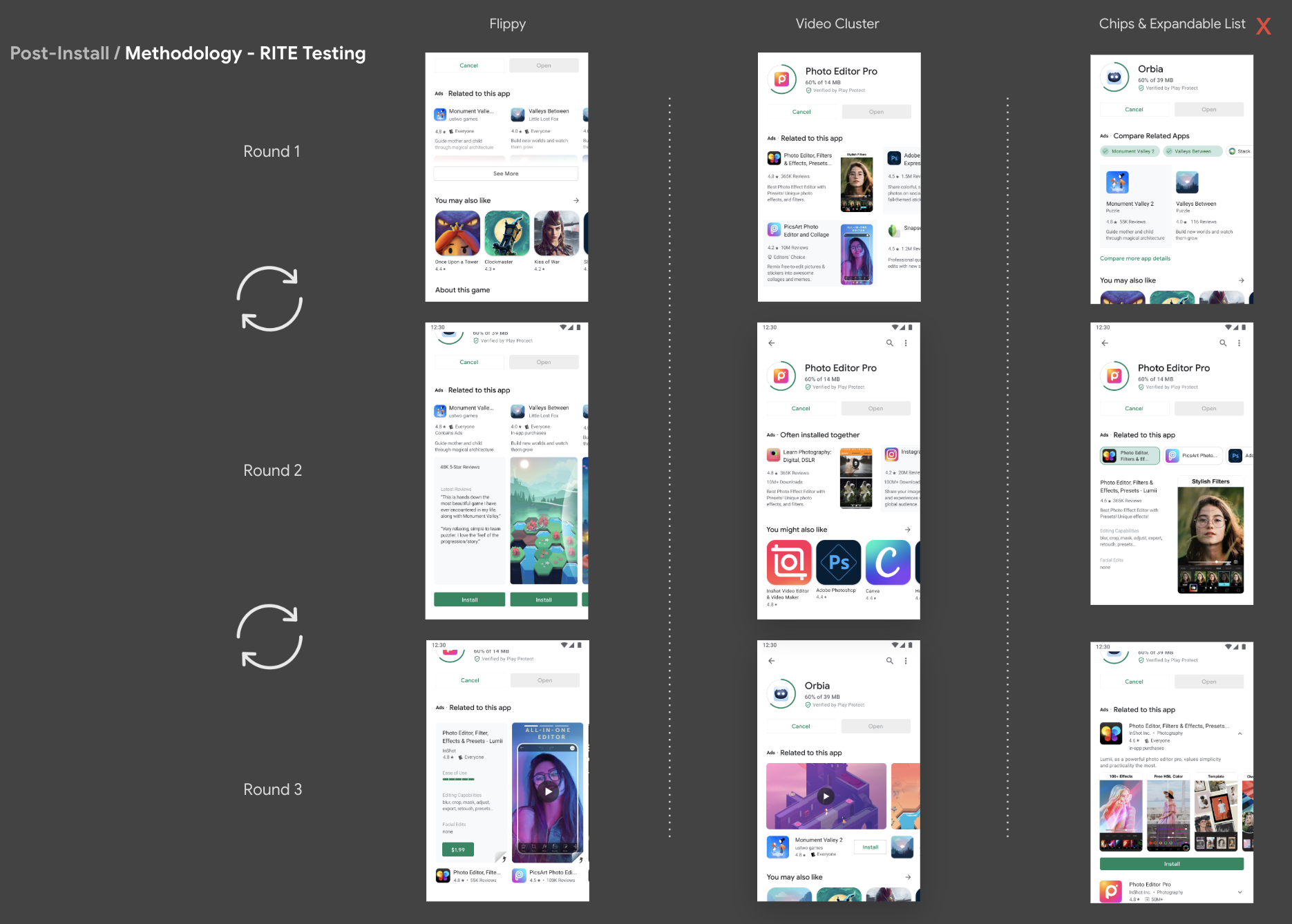
Based on what we found, I designed and moderated a remote RITE study. Three concepts, three rounds each, iterating live between rounds.
So, what actually made it into the design?
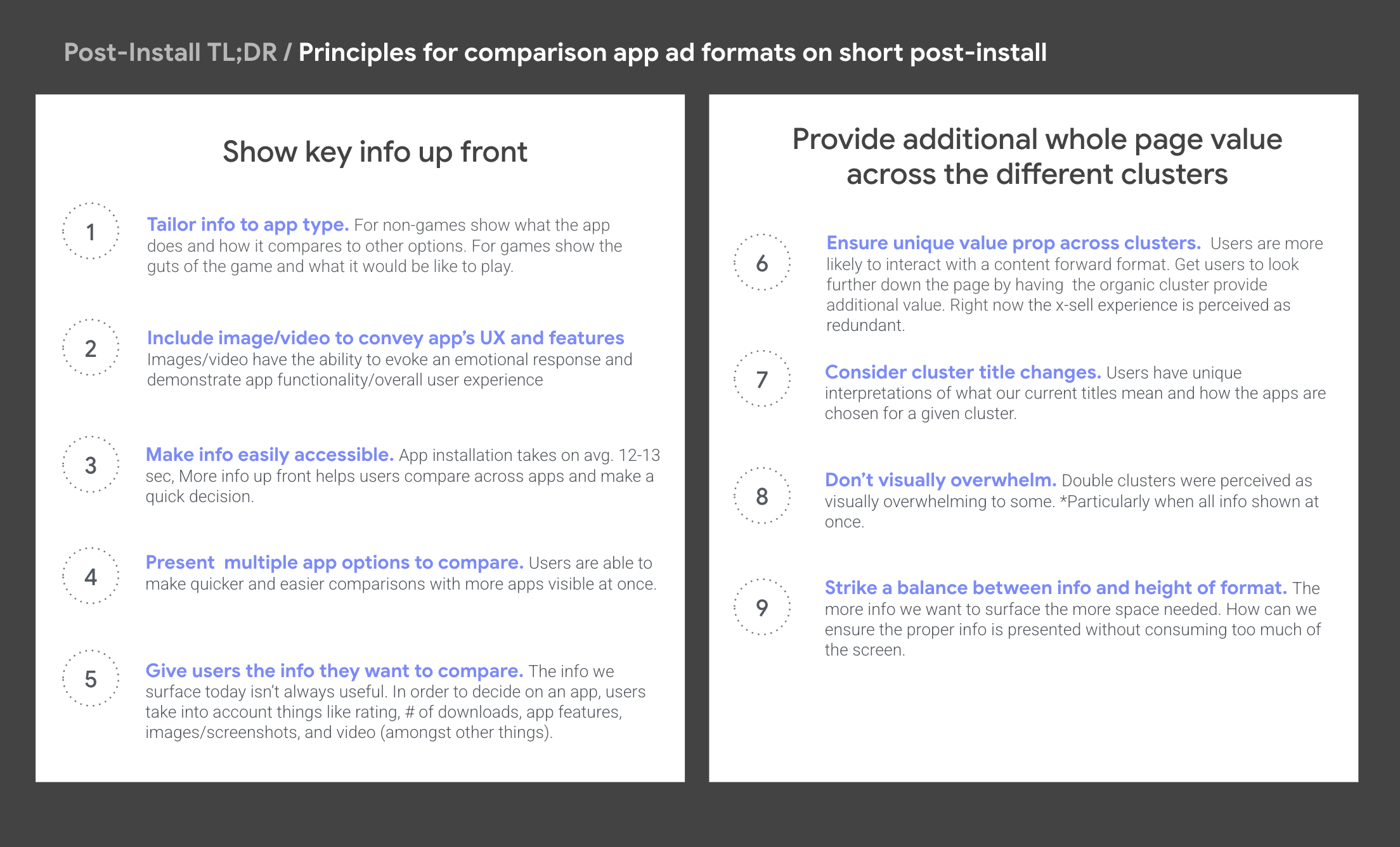
Three rounds of RITE testing sharpened everything from concept testing into nine concrete principles and design recommendations for the post-install ad format.
What came next
This research fed directly into follow-up experiments on copy, format, and content.
Short post-install ad formats eventually went live and outperformed the original icon cluster design.